
Garment District News | Costume Spotlight
47 Ronin’s Armor, Silk, Dye, and Fantasy Surface
In 47 Ronin, costume is not simply historical dress. It is allegiance, hierarchy, seduction, grief, mythology, and war — a visual world built from kimono layering, coded armor, dyed silk, distressed texture, and the cinematic tension between Japanese form and fantasy spectacle.

The costume design in 47 Ronin works because it does not pretend to be a strict historical recreation. Instead, it begins with Japanese silhouette logic — kimono structure, layering, armor proportion, ceremonial formality — and then pushes those foundations into a more stylized fantasy world through color, textile treatment, embellishment, and surface drama.
That balance is what gives the film its distinctive wardrobe language. The production starts from recognizable Japanese costume grammar, but the finish is more heightened, more cinematic, and far more interpretive. The result is a costume world that feels ceremonial, mythic, and emotionally coded at a glance.
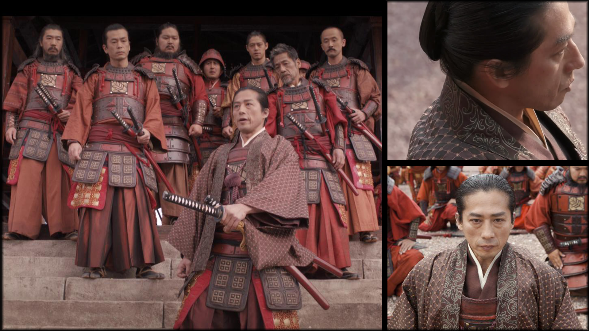
Dye and color are especially important here. Red, purple, gold, white, and saffron do not simply beautify the frame. They separate armies, define social order, and turn costume into a visual map of allegiance, corruption, ritual, and power.
The Designer Behind the Look

Image: Penny Rose, costume designer for 47 Ronin.
Penny Rose
Penny Rose approached 47 Ronin as a full-world costume build rather than a film built around a handful of hero garments. That matters because the movie depends on scale: armies, courts, supernatural figures, layered hierarchy, and multiple visual worlds all needed to read clearly and memorably.
What makes the design especially compelling is the tension between structure and surface. The underlying shapes often stay close to traditional Japanese dress logic, but the fabrics, colors, ornament, and treatment are pushed toward a more dramatic fantasy language. That is where the film finds its identity.
The Story Behind the Costume
One of the clearest indicators of the film’s wardrobe scale is the foundation layer: the production created more than a thousand white under-kimonos as the base for the costume world. From there, armor, silk, over-layers, ornament, and color coding could build upward into a system that looked expansive, ordered, and narratively legible.
The armor story is just as important. Rather than relying on heavy historical reproductions that would be punishing in action sequences, the film used large numbers of lightweight armor builds designed to read as substantial on screen while remaining workable for battle staging. This is where costume design becomes engineering: the surface has to look dense, ceremonial, and war-ready even when the build must remain wearable.
Dye and saturation sit at the center of how the film separates power centers. Ako’s reds read as martial honor and unified loyalty. Kira’s purples lean more decadent, theatrical, and unstable. The Shogun’s metallic gold becomes almost sacred in its stillness, while Mika’s pastels soften the frame into courtly refinement. Even before the viewer studies construction, the palette has already told them how to feel.
Character-specific finishing makes that logic even stronger. Kai’s wardrobe reads as rougher, patchier, and socially unresolved. Oishi’s costume language is more layered and complete, with the kind of formal build that suggests rank and command. Mika’s dress moves into silk and controlled softness, while the Witch deliberately departs from historical restraint into a more manipulated fantasy silhouette that feels seductive, dangerous, and visually invasive.
This is where surface treatment becomes essential. These garments cannot look newly made. In a film like 47 Ronin, distress, controlled dye depth, armor finish, embroidery, and wear patterns all help determine whether a look reads as inhabited, ceremonial, corrupt, spectral, or battle-seasoned. Costume here is not just clothing. It is world logic applied to fabric and finish.
“In 47 Ronin, dye and distress do as much storytelling as armor.”
Garment District News editorial takeaway.
Technical Breakdown
Textile
The wardrobe starts from kimono-based structure, but the textile language pushes beyond strict period replication into a more cinematic fantasy register. Silk, decorative weave, layered court cloth, and armor-facing materials all help the film move between tradition and myth.
Dye / Color Story
Color is one of the film’s main organizing tools. Red becomes military order and allegiance, purple becomes corruption and threat, metallic gold becomes ritualized authority, and softer pastels define court femininity and refinement. The palette is not incidental — it is structural.
Construction
Construction moves between kimono layering, multi-part court dress, and large-scale armor systems. Some costumes hold close to traditional silhouette logic, while others — especially supernatural looks — deliberately distort that shape language for dramatic effect.
Processing / Finish
Surface treatment is central to the film’s credibility. Dye depth, distress, metallic finish, embroidered detail, and the visual difference between polished ceremony and battle wear all determine how each character reads within the larger world.


Material and Cultural Context
47 Ronin is particularly revealing because it is not simply replicating history. It is adapting a legendary Japanese story through a fantasy blockbuster lens, and the costume design reflects that choice. Shape remains culturally grounded, but surface becomes more interpretive, more embellished, and more cinematic.
That makes the dyeing and finish work especially important. Once a costume world leaves strict replication behind, surface becomes the place where meaning is negotiated. Which garments remain restrained? Which are heightened? Which are roughened by wear? Which are polished into power? In 47 Ronin, those answers live directly in the costume department’s material choices.
For Garment District News, the film is a strong reminder that costume meaning often lives in treatment as much as in silhouette. A kimono-derived shape may be historically familiar, but it becomes cinematically specific through color saturation, distress, metallic finish, ornament, and the visual pressure of fantasy interpretation.
From Concept to Screen
The wardrobe begins with recognizable Japanese form while expanding into an unmistakably fantasy-driven costume universe.
Large quantities of under-kimonos, armor builds, and court garments created a full-system costume world rather than a small set of hero looks.
Faction color coding, controlled saturation, metallic finish, and surface distress turned structurally related garments into sharply different moral and visual worlds.
The film remains notable for how fully it uses color, armor, silk, and fantasy surface treatment to reinterpret a samurai legend for blockbuster cinema.
Gallery
Browse the image reference strip below and open each frame in a high-detail viewer to inspect armor coding, kimono layering, silk surface, dye saturation, embroidered detail, fantasy couture shapes, and faction color systems.
Why It Endures
The costumes in 47 Ronin endure because they commit fully to visual authorship. They do not rely on neutral historical prettiness. They use dye, distress, embroidery, armor coding, and silhouette manipulation to organize the film’s moral and emotional world.
That is what gives the wardrobe its afterlife. Court silk, militarized red, villainous purple, metallic authority, saffron ritual, and supernatural couture all coexist within the same film because the costume department gives each one its own surface logic. In that sense, 47 Ronin is less a film about clothing from the past than a film about how finish turns legend into cinema.